

Brand Guideline
X1 Ecochain 2026
Introduction
Brand Identity
X1 EcoChain:
Game
rules
This section describes the visual and verbal elements that form the X1 EcoChain identity. The name, logo, brand colors, typography, and graphics are all part of a unified system that conveys who we are and what we believe in.
Clear, consistent communication is key to creating a strong and recognizable brand. These guidelines help us speak a consistent visual language, regardless of where and how we are seen.
The X1 EcoChain brand is more than a logo. It is an asset we cherish. Everyone who works with X1 EcoChain's visual and verbal elements is responsible for its integrity. They must not be used out of context, distorted, or modified without approval. Everything must be accurate, precise, and in keeping with the X1 EcoChain style.
Corporate logo
Logo X1 EcoChain —
the foundation of the brand's visual code
The logo is the primary visual anchor for X1 EcoChain. It defines the brand's identity and serves as the foundation for all visual communication. It is a fixed combination of a symbol and a name—a unified, indivisible form that must not be altered under any circumstances.
The X1 EcoChain logo consists of a unique wordmark and a graphic symbol.
The typography was selected to convey the brand's character: modern, precise, and expressive.
We use the BICUBIC typeface; it pairs perfectly with the graphic element, underscoring X1 EcoChain’s technological nature and style.
-






1) Logo Concept
The graphic element of the X1 EcoChain logo is not merely decorative; it is the key to the brand's visual DNA. Based on the signature symbol, it reflects our technological nature, dynamism, and character.
This symbol encapsulates the X1 EcoChain identity: minimalist, powerful, and memorable.
-

2) Logo Name
The name "X1 EcoChain" is rendered in a carefully selected typeface that combines modernity, elegance, and excellent readability. This is more than just typography; it is a visual expression of the brand’s character—confident, tech-forward, and future-oriented.
-


3) Primary Logo
The main version of the X1 EcoChain logo comes in two variants: light and dark. The light version is used on dark backgrounds, while the dark version is used on light backgrounds. This approach ensures maximum legibility and visual integrity in any environment.
Safe area
X1 EcoChain
logo safe area
The X1 EcoChain logo must be used without the addition of extraneous graphics, backgrounds, or decorative elements.
To maintain visual clarity, a clear space—a minimum area free of any visual elements—is designated around the logo.
This zone protects the integrity of the brand mark and ensures its recognizability in any context. The logo and name are always used as a fixed unit—no modifications, no compromises.


Minimum size
To maintain readability and recognizability, the X1 EcoChain logo must not be used below the established minimum size. This ensures that all elements—both the symbol and the text—remain clear and distinguishable.
Permitted use
A logo is no place
for experiments.
We have put a great deal of effort into creating the X1 EcoChain logo and have clearly defined the rules for its use. We value creativity, but not at the expense of our brand identity fundamentals. The logo is not a subject for experimentation; it is a brand symbol that demands respect.
Before using the logo, please be sure to review the examples of permitted and prohibited usage. By following these guidelines, you help ensure that X1 EcoChain presents itself exactly as intended: stylish, professional, and confident.
Permitted


Prohibited

It is strictly prohibited to distort the logo, alter its proportions, fill it with a solid color not included in the brand palette, or apply any visual effects—such as gradients, shadows, glows, and the like.
Co-branding
Our brand
in partnership


- The primary format for co-branding is horizontal. In this layout, the partner logo is placed to the right of the X1 EcoChain logo, ensuring balance and readability in joint communications.
- The vertical version is used when horizontal placement is not feasible due to format constraints; in this case, the partner logo is placed beneath the X1 EcoChain logo.
In all cases, it is important to maintain the exclusion zone and not alter the logo proportions.
Combining logos with different orientations is prohibited. If a partner's logo is in a horizontal format, the X1 Ecochain logo must also be used in its horizontal version. Visual consistency is a mandatory requirement for co-branding.
Brand voice in text
Suisse
Int’l
ABCDEFGHIJKLMNOPQRSTUVWXYZ abcdefghijklmnopqrstuvwxyz 1234567890!@£$%^&
A modern sans-serif with a Swiss character.
Suisse Int’l is a versatile sans-serif typeface designed for clean, confident, and high-tech communication. It scales exceptionally well, maintains readability at any size, and lends text a rigorous structure without sacrificing expressiveness.
Its neutrality and balanced geometry make it an ideal choice for body text, headlines, and interfaces, underscoring the professional and minimalist style of the X1 EcoChain brand.
- Ultra Light
- Thin
- Light
- Regular
- Book
- Medium
- Black
- Semibold
- Bold
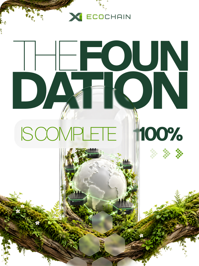
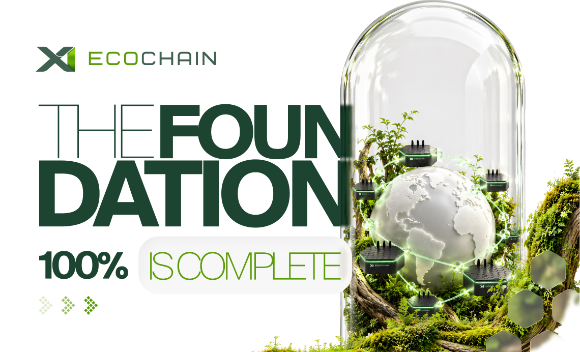
Standard layout
Logic and rhythm
of the layout
-
Horizontal orientation:
- The X1 EcoChain logo is placed in the top-left corner, respecting the established clear space.
- The main headline is left-aligned—within the logo's alignment boundaries—and vertically centered relative to the layout.
- Technical information is placed in the bottom-left corner, also within the clear space boundaries.
-
Vertical orientation:
- All key elements (logo, headline, technical information) are aligned along the layout's left vertical axis, maintaining visual rhythm and order.
The use of the X1 EcoChain brand in contexts involving violence, pornography, political or religious conflicts, or any form of discrimination is prohibited. We strictly adhere to principles of respect, neutrality, and professional ethics.
Our color
Color code
X1 EcoChain
Shown on the right are colors adapted for various media and environments. The primary palette is designed to establish a unified visual voice for the brand.
The consistent and coherent use of these shades helps create a cohesive, harmonious, and recognizable image for X1 EcoChain across all communication channels.
-
- RGB
- #DBFC55
- CMYK
- 19%, 0%, 100%, 6%
- Pantone
- 381 C
-
- RGB
- #9D9DA8
- CMYK
- 46%, 95%, 0%, 1%
- Pantone
- 266 C
-
- RGB
- #101010
- CMYK
- 0%, 0%, 0%, 100%
- Pantone
- 6 C